and I will post there instead of here.
Sunday, November 16, 2014

Sunday, October 5, 2014
Berkson's paradox
Berkson's paradox is a counter-intuitive result in probability and statistics. Imagine that we have two independent events A and B. By definition of independence, the conditional probability of event A given B is the same as the probability of event A:
P(A | B) = P(A).
i.e., knowing that event B occurred gives us no information about the probability that A occurred.
Berkson's paradox is that, if we restrict ourselves to the cases where events A or B occur-- where least one of the events A or B occurs-- knowledge that B has occurred makes it less likely that A has occurred:
P(A | B, A or B) < P(A | A or B) *.
The reason that this result is counter-intuitive is that A and B are independent events, but they become negatively dependent on each other when we restrict ourselves to the cases that A or B occurs. We will see that Berkson's paradox is a form of selection bias; in restricting ourselves to A or B, we ignore the cases where both A and B do not occur.
Berkson's paradox can be used to explain the stereotype that the most handsome men are jerks and that the nicest men are ugly, proposed by Jordan Ellenberg in his book How Not to Be Wrong.
Let's assume for the moment that looks and niceness are independent variables in the population of males so that men are randomly distributed on the looks-niceness plane:
 So each guy is a point in this plane. Every girl wants to date a guy in the top right corner of this plot**: a man that is both handsome and nice. However, if a guy is a jerk sometimes, she might still date him if he is super good-looking. Also, if a guy is extremely nice, she might still date him even if he is lacking in the looks category. Thus, the guys that she is willing to date are probably where:
niceness + looks > some constant value,
the green points in the upper-right corner:

From this natural compromising behavior in her dating criterion, many of the best-looking guys that this girl dates are not so nice; many of the nicest guys she dates are not as good-looking. By restricting herself to this set of guys, she sees a negative correlation between looks and niceness, despite these two variables being independent in the population! This is Berkson's paradox, and now you can see that this induced correlation stems from selection bias.
We can go one step further: maybe the guys in the very top-right corner (red points) are so nice and handsome that they will not consider dating the girl we are considering, who is just decently nice and good-looking.

Now her dating pool is even more restricted due to selection bias, and the negative correlation between good looks and niceness is even more severe.
The lesson here is that we can see spurious correlations between variables as a result of selection bias. We must think carefully about if our experiences and data collection strategies adequately sample the population in question to make sound conclusions from our observations.
The paradox is named after Joseph Berkson, who pointed out a selection bias in case-control studies to identify causal risk factors for a disease. If the control group is taken from within the hospital, a negative correlation could arise between the disease and the risk factor because of different hospitalization rates among the control and case sample.
Another example comes from the book Causality: Models, Reasoning, and Inference by Judea Pearl regarding university admissions criteria. The admissions office at a university may consider both GPA and SAT scores for admissions. Of course, the university wants students with both a high GPA and high SAT. However, a schools may still admit a student with a poor GPA if he or she has a very high SAT score and admit a student with a poor SAT score if he or she compensates with a high GPA. Even if the GPA and SAT scores were independent variables, this selection bias could induce a negative correlation between GPA and SAT scores among the student body.
[1] Berkson, Joseph (June 1946). "Limitations of the Application of Fourfold Table Analysis to Hospital Data". Biometrics Bulletin 2 (3): 47–53
* We need 0 < P(A), P(B) < 1 for this. That is, the events have to be interesting enough that A/B do not occur with certainty or never.
** Of course, niceness and handsomeness are [hopefully] not the only variables that a girl will consider in the guys that she dates. Please excuse this simplification.
P(A | B) = P(A).
i.e., knowing that event B occurred gives us no information about the probability that A occurred.
Berkson's paradox is that, if we restrict ourselves to the cases where events A or B occur-- where least one of the events A or B occurs-- knowledge that B has occurred makes it less likely that A has occurred:
P(A | B, A or B) < P(A | A or B) *.
The reason that this result is counter-intuitive is that A and B are independent events, but they become negatively dependent on each other when we restrict ourselves to the cases that A or B occurs. We will see that Berkson's paradox is a form of selection bias; in restricting ourselves to A or B, we ignore the cases where both A and B do not occur.
Berkson's paradox can be used to explain the stereotype that the most handsome men are jerks and that the nicest men are ugly, proposed by Jordan Ellenberg in his book How Not to Be Wrong.
Let's assume for the moment that looks and niceness are independent variables in the population of males so that men are randomly distributed on the looks-niceness plane:
niceness + looks > some constant value,
the green points in the upper-right corner:
We can go one step further: maybe the guys in the very top-right corner (red points) are so nice and handsome that they will not consider dating the girl we are considering, who is just decently nice and good-looking.
Now her dating pool is even more restricted due to selection bias, and the negative correlation between good looks and niceness is even more severe.
The lesson here is that we can see spurious correlations between variables as a result of selection bias. We must think carefully about if our experiences and data collection strategies adequately sample the population in question to make sound conclusions from our observations.
The paradox is named after Joseph Berkson, who pointed out a selection bias in case-control studies to identify causal risk factors for a disease. If the control group is taken from within the hospital, a negative correlation could arise between the disease and the risk factor because of different hospitalization rates among the control and case sample.
Another example comes from the book Causality: Models, Reasoning, and Inference by Judea Pearl regarding university admissions criteria. The admissions office at a university may consider both GPA and SAT scores for admissions. Of course, the university wants students with both a high GPA and high SAT. However, a schools may still admit a student with a poor GPA if he or she has a very high SAT score and admit a student with a poor SAT score if he or she compensates with a high GPA. Even if the GPA and SAT scores were independent variables, this selection bias could induce a negative correlation between GPA and SAT scores among the student body.
[1] Berkson, Joseph (June 1946). "Limitations of the Application of Fourfold Table Analysis to Hospital Data". Biometrics Bulletin 2 (3): 47–53
* We need 0 < P(A), P(B) < 1 for this. That is, the events have to be interesting enough that A/B do not occur with certainty or never.
** Of course, niceness and handsomeness are [hopefully] not the only variables that a girl will consider in the guys that she dates. Please excuse this simplification.
Thursday, July 31, 2014
Frequentist vs. Bayesian Statistics
Two approaches to problems in the world of statistics and machine learning are that of frequentist and Bayesian statistics. This comic from XKCD illustrates a difference between the two viewpoints.

We have a neutrino detector that measures whether the sun has gone nova. The detector is not perfect; 1/36 times, the detector incorrectly indicates whether or not the sun has gone nova. [The probability of rolling two fair die as both 6 is 1/6 * 1/6 = 1/36.]
Next, we push the button on the detector to try it, and it indicates that the sun has gone nova. Has the sun indeed exploded? [The sun is shining on the other side of the earth, and there is a time lag for the light from the sun to reach us.]
The frequentist might make the following point. The probability that the detector would lie to us is 1/36. That's pretty small...
The Bayesian statistician cannot argue with this point. However, and this is the distinction between the two mindsets, the Bayesian statistician would take his or her prior knowledge into account that the probability of the sun exploding today is very small, so most likely the detector is lying, in spite of the fact that the detector is unlikely to lie.
Let's put this into some formal mathematics. Define two events:
E: the sun has exploded
D: the neutrino detector has detected an explosion.
We know that the probability that the detector has detected an explosion given that there was not actually an explosion is P(D | ~E) = 1/36. The quantity that we're interested in for making this bet is the probability that there was actually an explosion given the data that the detector has detected an explosion, P(E | D). A fancy name for this probability is the posterior probability.
To get the posterior P(E | D), we need to use Bayes' theorem:
P(E | D) = P(D | E) P(E) / P(D).
The term P(D | E) is called the likelihood; this is the probability of observing the data given the event. Frequentists focus on the likelihood when determining whether or not an event has occurred. In this case,
P(D | E) = 1 - P(~D | E) = 1 - 1/36 = 35/36.
The likelihood is quite high, so the frequentist might conclude that the sun indeed exploded.
However, of course, Bayes' theorem tells us that there is another contribution to the story: the term P(E), which is called the prior. This is simply the probability that the sun has exploded. We know that this is indeed very small, and the Bayesian statistician would inject this "prior knowledge" into the problem, hence taking the prior probability P(E) into account in determining P(E | D).
The probability of the detector detecting an explosion P(D) is somewhat redundant since we can write it in terms of other quantities:
P(D) = P(D | E) P(E) + [1 - P(D | E)] [1 - P(E)].
... = 34/36 P(E) + 1/36.
Note that this term goes to 1/36 as P(E) gets small and is 35/36 if P(E) = 1 (i.e. if the sun exploded with certainty) .
Thus, we should write the probability that the sun actually exploded, given our evidence that the neutrino detector went off,
P(E | D) = 35/36 P(E) / ( 34/36 P(E) + 1/36).
At small prior probabilities, this looks like
P(E | D) ~ 35 P(E).
The Bayesian statistician knows that the astronomically small prior P(E) overwhelms the high likelihood P(D | E).
In this problem, we clearly have a reason to inject our belief/prior knowledge that P(E) is very small, so it is very easy to agree with the Bayesian statistician. However, in many cases, it is difficult or unjustified to assume prior knowledge P(E).
This bet is quite moot anyway. Consider the "loss function": if the Bayesian statistician is correct, you lose $50. If the Bayesian statistician is incorrect, the world will end and you probably won't have a chance to spend the $50.
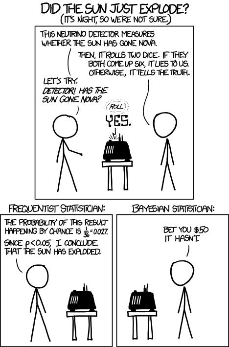
Next, we push the button on the detector to try it, and it indicates that the sun has gone nova. Has the sun indeed exploded? [The sun is shining on the other side of the earth, and there is a time lag for the light from the sun to reach us.]
The frequentist might make the following point. The probability that the detector would lie to us is 1/36. That's pretty small...
The Bayesian statistician cannot argue with this point. However, and this is the distinction between the two mindsets, the Bayesian statistician would take his or her prior knowledge into account that the probability of the sun exploding today is very small, so most likely the detector is lying, in spite of the fact that the detector is unlikely to lie.
Let's put this into some formal mathematics. Define two events:
E: the sun has exploded
D: the neutrino detector has detected an explosion.
We know that the probability that the detector has detected an explosion given that there was not actually an explosion is P(D | ~E) = 1/36. The quantity that we're interested in for making this bet is the probability that there was actually an explosion given the data that the detector has detected an explosion, P(E | D). A fancy name for this probability is the posterior probability.
To get the posterior P(E | D), we need to use Bayes' theorem:
The term P(D | E) is called the likelihood; this is the probability of observing the data given the event. Frequentists focus on the likelihood when determining whether or not an event has occurred. In this case,
P(D | E) = 1 - P(~D | E) = 1 - 1/36 = 35/36.
The likelihood is quite high, so the frequentist might conclude that the sun indeed exploded.
However, of course, Bayes' theorem tells us that there is another contribution to the story: the term P(E), which is called the prior. This is simply the probability that the sun has exploded. We know that this is indeed very small, and the Bayesian statistician would inject this "prior knowledge" into the problem, hence taking the prior probability P(E) into account in determining P(E | D).
The probability of the detector detecting an explosion P(D) is somewhat redundant since we can write it in terms of other quantities:
P(D) = P(D | E) P(E) + [1 - P(D | E)] [1 - P(E)].
... = 34/36 P(E) + 1/36.
Note that this term goes to 1/36 as P(E) gets small and is 35/36 if P(E) = 1 (i.e. if the sun exploded with certainty) .
Thus, we should write the probability that the sun actually exploded, given our evidence that the neutrino detector went off,
P(E | D) = 35/36 P(E) / ( 34/36 P(E) + 1/36).
At small prior probabilities, this looks like
P(E | D) ~ 35 P(E).
The Bayesian statistician knows that the astronomically small prior P(E) overwhelms the high likelihood P(D | E).
In this problem, we clearly have a reason to inject our belief/prior knowledge that P(E) is very small, so it is very easy to agree with the Bayesian statistician. However, in many cases, it is difficult or unjustified to assume prior knowledge P(E).
This bet is quite moot anyway. Consider the "loss function": if the Bayesian statistician is correct, you lose $50. If the Bayesian statistician is incorrect, the world will end and you probably won't have a chance to spend the $50.
Sunday, July 20, 2014
Solution to the card-deck challenge
Hello again for part 2 of my guest appearance.
You guys are fantastic! Cory and I were very impressed by your suggestions and creativity at solving the card-deck challenge:
Five random cards are drawn from a deck of 52 cards (four suits and 13 cards per suit). You see all five cards and can decide which four of those cards you want to reveal to your partner, and in which order. Is there an ordering scheme that you and your partner can agree on beforehand that allows your partner to determine the fifth (hidden) card from the choice and order of the four cards that you reveal?
The three correct solutions that we received were from Douglas, James, and Vince. Congratulations to all three of you!
If you want to solve it yourself, this is your last chance. I will reveal the solution below this cute lolcat:

Okay, here we go. Surprisingly, such a scheme can be found, and it's actually easy enough to memorize so that you can perform this at your next dinner party. Below I explain one possible scheme, and there are certainly many other conventions that would work just as well.
As a reminder, all we have to choose is which card we hide and want our partner to guess, let's call this card the target, and in what order we want to reveal the other four cards.
We need to signal the suit and the value of the target card. The former is easy: Since we are given five cards of a deck of four suits, we can employ one of my favourite "you don't say" math theorems, the Pigeonhole principle, to realize that there will always be a pair of cards with the same suit. Hence:
Rule 1: The first card that you reveal is the same suit as the target (the card that will be hidden).
So far so good, by revealing one card we reduce the number of possible targets from 48 (52 - 4 revealed cards) to 12 (13 - 1 revealed card of the same suit).
To signal the rank is harder, because in the worst case we don't have any influence about which three cards Rule 1 leaves us with. So we have to assume these three cards are entirely random. All right, how many ways do we have to order three random cards? That's 6, because there are three choices for which card to show first, each of those gives us two choices of which card to show second, and the last card is determined by that: 3*2 = 6. This means that we can signal any number 1, 2, 3, 4, 5, or 6. A simple scheme of how to signal which number exactly is below, all we need to know at this point is that six different patterns is all the three middle cards can give us.
Rule 2: Use the three middle cards to signal the distance in rank between the first card and the target.
That's almost the entire trick, but there is one more idea required to reduce the number of possible targets from 12 to 6. To begin with, we realize that Rule 1 just says that one of the two cards of the same suit needs to be revealed first, but it does not state which one. For example, we could agree to always show the lower of the two cards, and then using the three middle cards to signal how many ranks higher the target is. This works well in half of the cases: Whenever the higher card is at most six ranks higher than the lower card. For example, given these five cards
we would choose the target to be ♣K, the first card to be ♣8, and the three remaining cards to signal a five, since the King is five ranks higher than the Eight.
And what do we do when the two cards of the same suit are more than six apart? The beautiful answer is: They are not! At least not modulo 13:
It turns out that the distance between any two of the 13 cards of the same suit is at most 6 (=floor(13/2)), if you continue counting from the beginning once you hit the Ace. For example, the distance between Q and 3 is four, the distance between J and 4 is six.
Rule 3: Choose which of the two possible first cards to show (Rule 1) such that the targets' rank is at most 6 (modulo 13) ranks above the first card.
And that's all there is to it. We are now able to choose four cards in such a way that our partner will be able to calculate the remaining fifth card. For example:
Given ♣2, ♣A, ♠Q, ♡3, ♡Q, we can either play for clubs and show ♣A first and signal one, or play for hearts, show ♡Q first and signal four.
As a final step, here is a scheme of how use the three middle cards to signal the number 1, 2, 3, 4, 5 or 6: Start with choosing an order for all 52 cards. For example: The higher the rank, the higher the card, and if the rank is the same, then use the suit order ♣ > ♠ > ♡ > ♢. Once we agree on the order of the three cards, low, mid, high, it is easy to translate that into the numbers from 1 to 6:
low, mid, high -> 1
low, high, mid -> 2
mid, low, high -> 3
mid, high, low -> 4
high, low, mid -> 5
high, mid, low -> 6
Concluding examples
1) Given these five cards, ♣8, ♣K, ♠Q, ♡6, ♢Q, which cards should we reveal and in which order?
According to Rule 1, the first and target card will be a club. The ♣K is 5 ranks higher than the ♣8, while the ♣8 is 8 ranks higher than the ♣K. Hence, according to Rule 3, we first reveal ♣8 and let ♣K be the target. With the remaining cards ♠Q, ♡6, ♢Q we have to signal 5, and hence reveal the highest card second, ♠Q, then the lowest, ♡6, and as fourth card the middle, ♢Q.
2) Given the cards in the initial screenshot, the target card must be ♢A, because that's the spade which is one (the three middle cards are sorted in low, mid, high) above the ♢K.
Addendum:
A similar, yet distinct, solution is the following: Ignoring Rule 1 and the suits gives us 4*3*2 = 24 ways to reveal four well-ordered cards. We reveal 4 of the 52 cards, leaving us with 48 possible targets. Since two cards can be at most 48/2 = 24 ranks apart (use a larger version of the circle and calculate modulo 48) we can agree that the target card is 1, 2, ..., or 24 ranks higher than the highest revealed card.
You guys are fantastic! Cory and I were very impressed by your suggestions and creativity at solving the card-deck challenge:
Five random cards are drawn from a deck of 52 cards (four suits and 13 cards per suit). You see all five cards and can decide which four of those cards you want to reveal to your partner, and in which order. Is there an ordering scheme that you and your partner can agree on beforehand that allows your partner to determine the fifth (hidden) card from the choice and order of the four cards that you reveal?
The three correct solutions that we received were from Douglas, James, and Vince. Congratulations to all three of you!
If you want to solve it yourself, this is your last chance. I will reveal the solution below this cute lolcat:
Okay, here we go. Surprisingly, such a scheme can be found, and it's actually easy enough to memorize so that you can perform this at your next dinner party. Below I explain one possible scheme, and there are certainly many other conventions that would work just as well.
As a reminder, all we have to choose is which card we hide and want our partner to guess, let's call this card the target, and in what order we want to reveal the other four cards.
We need to signal the suit and the value of the target card. The former is easy: Since we are given five cards of a deck of four suits, we can employ one of my favourite "you don't say" math theorems, the Pigeonhole principle, to realize that there will always be a pair of cards with the same suit. Hence:
Rule 1: The first card that you reveal is the same suit as the target (the card that will be hidden).
So far so good, by revealing one card we reduce the number of possible targets from 48 (52 - 4 revealed cards) to 12 (13 - 1 revealed card of the same suit).
To signal the rank is harder, because in the worst case we don't have any influence about which three cards Rule 1 leaves us with. So we have to assume these three cards are entirely random. All right, how many ways do we have to order three random cards? That's 6, because there are three choices for which card to show first, each of those gives us two choices of which card to show second, and the last card is determined by that: 3*2 = 6. This means that we can signal any number 1, 2, 3, 4, 5, or 6. A simple scheme of how to signal which number exactly is below, all we need to know at this point is that six different patterns is all the three middle cards can give us.
Rule 2: Use the three middle cards to signal the distance in rank between the first card and the target.
That's almost the entire trick, but there is one more idea required to reduce the number of possible targets from 12 to 6. To begin with, we realize that Rule 1 just says that one of the two cards of the same suit needs to be revealed first, but it does not state which one. For example, we could agree to always show the lower of the two cards, and then using the three middle cards to signal how many ranks higher the target is. This works well in half of the cases: Whenever the higher card is at most six ranks higher than the lower card. For example, given these five cards
 |
| Following Rule 1, we have to choose one of the clubs as the target. Choosing ♣K as target we can use the non-clubs to signal that the target is five ranks above the ♣8, which is possible by Rule 2. |
we would choose the target to be ♣K, the first card to be ♣8, and the three remaining cards to signal a five, since the King is five ranks higher than the Eight.
And what do we do when the two cards of the same suit are more than six apart? The beautiful answer is: They are not! At least not modulo 13:
 |
| No two cards can be more than six ranks apart (modulo 13). |
It turns out that the distance between any two of the 13 cards of the same suit is at most 6 (=floor(13/2)), if you continue counting from the beginning once you hit the Ace. For example, the distance between Q and 3 is four, the distance between J and 4 is six.
Rule 3: Choose which of the two possible first cards to show (Rule 1) such that the targets' rank is at most 6 (modulo 13) ranks above the first card.
And that's all there is to it. We are now able to choose four cards in such a way that our partner will be able to calculate the remaining fifth card. For example:
Given ♣2, ♣A, ♠Q, ♡3, ♡Q, we can either play for clubs and show ♣A first and signal one, or play for hearts, show ♡Q first and signal four.
 |
| We can choose if we want to let ♣2 or ♡3 be the target. |
As a final step, here is a scheme of how use the three middle cards to signal the number 1, 2, 3, 4, 5 or 6: Start with choosing an order for all 52 cards. For example: The higher the rank, the higher the card, and if the rank is the same, then use the suit order ♣ > ♠ > ♡ > ♢. Once we agree on the order of the three cards, low, mid, high, it is easy to translate that into the numbers from 1 to 6:
low, mid, high -> 1
low, high, mid -> 2
mid, low, high -> 3
mid, high, low -> 4
high, low, mid -> 5
high, mid, low -> 6
Concluding examples
1) Given these five cards, ♣8, ♣K, ♠Q, ♡6, ♢Q, which cards should we reveal and in which order?
According to Rule 1, the first and target card will be a club. The ♣K is 5 ranks higher than the ♣8, while the ♣8 is 8 ranks higher than the ♣K. Hence, according to Rule 3, we first reveal ♣8 and let ♣K be the target. With the remaining cards ♠Q, ♡6, ♢Q we have to signal 5, and hence reveal the highest card second, ♠Q, then the lowest, ♡6, and as fourth card the middle, ♢Q.
2) Given the cards in the initial screenshot, the target card must be ♢A, because that's the spade which is one (the three middle cards are sorted in low, mid, high) above the ♢K.
 |
The hidden target card is ♢A, because that's the spade one rank higher than the first card ♢K.
|
Addendum:
A similar, yet distinct, solution is the following: Ignoring Rule 1 and the suits gives us 4*3*2 = 24 ways to reveal four well-ordered cards. We reveal 4 of the 52 cards, leaving us with 48 possible targets. Since two cards can be at most 48/2 = 24 ranks apart (use a larger version of the circle and calculate modulo 48) we can agree that the target card is 1, 2, ..., or 24 ranks higher than the highest revealed card.
Monday, July 7, 2014
A card-deck challenge
Hello Mathemathinking readers,
today's post is a bit special in two ways: First, I'm not Cory. My name is Bernhard, and I was Cory's Math office mate at UBC in Vancouver.
Several times Cory and I chatted about writing a blog together, and I'm happy to finally contribute to his page. In fact, it will be a double header: I want to challenge you to a fun quiz, and will give a week's time to find a solution, before I reveal my answer. Email full solutions to me, or discuss the problem in the comments below (hints are welcome, but please don't post full solutions in the comments). Ready? Here we go:
You need a partner, and a standard 52-card deck with four suits and 13 cards per suit (no jokers). Five random cards are drawn from the deck. While you see none of the cards, your partner is allowed to view all five. Your partner then decides which four of those cards she wants to reveal to you and in which order. Is there an ordering scheme that you and your partner can agree on beforehand that allows you to determine the fifth (hidden) card from the choice and order of the four cards that your partner shows?
If you think that's always possible, explain your scheme.
Otherwise, explain why such a general algorithm can not exist.
To clarify: Since your partner can choose which four cards to show, he also chooses the card you have to guess. Also, all the information you get is the rank and the suit of the four cards, and the order in which they are revealed. There is no additional information in the way the cards are revealed (eg your partner can not flip some of the cards to signal additional information).
Good luck, I look forward to your answers!
today's post is a bit special in two ways: First, I'm not Cory. My name is Bernhard, and I was Cory's Math office mate at UBC in Vancouver.
 |
| Janelle, Cory and me at a hike last summer |
Several times Cory and I chatted about writing a blog together, and I'm happy to finally contribute to his page. In fact, it will be a double header: I want to challenge you to a fun quiz, and will give a week's time to find a solution, before I reveal my answer. Email full solutions to me, or discuss the problem in the comments below (hints are welcome, but please don't post full solutions in the comments). Ready? Here we go:
You need a partner, and a standard 52-card deck with four suits and 13 cards per suit (no jokers). Five random cards are drawn from the deck. While you see none of the cards, your partner is allowed to view all five. Your partner then decides which four of those cards she wants to reveal to you and in which order. Is there an ordering scheme that you and your partner can agree on beforehand that allows you to determine the fifth (hidden) card from the choice and order of the four cards that your partner shows?
If you think that's always possible, explain your scheme.
Otherwise, explain why such a general algorithm can not exist.
 |
| Can you find a scheme that uniquely determines the fifth hidden card? |
Good luck, I look forward to your answers!
Monday, June 9, 2014
Voronoi cookies and the Post Office Problem
In an attempt to bake cookies, I failed to place the balls of dough far enough apart and, instead, a cookie cake formed. The result resembles a very useful diagram in mathematics called a Voronoi tessellation.


What I was excited about when I pulled this out of the oven was the boundary that formed between the regions intended to be separate cookies. The regions of space circumscribed around these boundaries (the "intended cookies") are called Voronoi cells. I drew the lines that approximately partition the area of the pan into Voronoi cells. You can also imagine the center of the balls of cookie dough that I placed in the pan before I put it in the oven, marked as red points that I will call sites $p_k$.
In a Voronoi diagram, all points on these lines are equidistant from the two sites of the adjoining Voronoi cells. All points inside the regions circumscribed by these lines are thus closer to the site of that Voronoi cell than any other Voronoi cell sites.
This leads to the mathematical definition of a Voronoi cell or region $R_k$ of a site $p_k$ (the cookie centers) as all points $x$ that are closer to site $p_k$ than any other site:
$R_k:=\{x : d(x,p_k) < d(x,p_j)$ for all $j \neq k\}$.
Here, $d(x,p_k)$ is notation for the distance between point $x$ and site $p_k$.
How are Voronoi cells useful? Consider a classic optimization problem called the Post Office Problem. A new city has just built 10 post offices. With the aim of reducing the cost of delivering mail, how can we optimally assign each residence a post office from which to receive mail?
Assuming that the density of residences is spatially uniform, we seek to assign each house to the nearest post office*. Thinking of the location of the post offices as sites $p_k$, the solution to the optimization problem is to assign all houses in the Voronoi cell $R_k$ to post office $k$. This is because each point in the Voronoi cell $k$ is by definition closest to post office $k$ (located at $p_k$) than any other post office.
Another amusing story is that of a physician John Snow, who in London in 1854, suggested with a Voronoi diagram that Cholera was being spread by drinking water instead of through the air, as thought at the time. He plotted the Cholera cases on a map of London and imagined the water pumps as sites $p_k$, drawing the Voronoi diagram of these sites. He noticed that the victims appeared within a Voronoi cell of a certain [infected] water pump. The assumption here is that people get their water primarily from the closest water pump. This suggested that instead Cholera is water-borne and identified the problematic water source [1].
In my research group at Berkeley, we use Voronoi diagrams to model the pore space of nanoporous materials [2]. This geometrical representation of a material helps us search for materials that are suitable for applications such as storing natural gas for vehicular fuel tanks and separating carbon dioxide from the flue gas of coal-fired power plants.
In machine learning, the branch of artificial intelligence that enables self-driving cars and the recommendation algorithms of Netflix, one supervised classification algorithm uses the Voronoi network, called nearest-neighbor classification. Let's say Netflix has a vector of data about you, including your age, gender, and what movies you've watched/how you've rated them. This is some representation of you in higher dimensional space. One strategy for recommending your next movie might be to simply find the person that is most like you in their database, see what movies that person likes, and recommend these movies to you. This corresponds to finding the site $p_k$ (representing the person most like you) in high dimensional space such that you lie in the Voronoi cell $R_k$.
My colleague at Berkeley, upon reading this post, mentioned that she uses Voronoi tessellations to characterize how polymers interact with water, aiding in the identification of polymers for drug delivery and lubricants.
Finally, why did the cookie cake form a Voronoi diagram? I think that one can prove that baking cookies will form a Voronoi network if you assume that each cookie expands from its center at a constant, uniform rate and stops expanding when it meets the surface of another cookie. The points where the boundaries of the intended cookies meet will form the lines in the Voronoi diagram. My cookie cake is not a perfect Voronoi diagram because a) each cookie was not initially the same shape and b) the boundary of the pan does not allow for a radially symmetric cookie expansion.
* The problem is realistically more complicated because mailmen must take roads, and these are not straight from the post office to the residences. Still, this may be a reasonable approximation.
[1] http://plus.maths.org/content/uncovering-cause-cholera
[2] Marielle Pinheiro, Richard L. Martin, Chris H. Rycroft, Andrew Jones, Enrique Iglesia, Maciej Haranczyk, Characterization and comparison of pore landscapes in crystalline porous materials, Journal of Molecular Graphics and Modelling, Volume 44, July 2013, Pages 208-219,
Thursday, May 22, 2014
Feel like your lovers had more lovers than you?
Most people have had fewer lovers than their lovers have, on average.
The fact that sex is symmetric makes this seem paradoxical. If person X slept with person Y, of course person Y slept with person X. So, how can we possibly expect that a given person has had fewer lovers than their lovers?
The answer is that you are more likely to have sex with someone that has had sex with a lot of people. Let's say person X has slept with 25 people, whereas person Y has slept with one. Then, [if you choose your partners at random] you are 25 times as likely to have slept with person X than person Y.
This is a form of sampling bias. As individuals, we are more likely to sample [sleep with] those that are more sexually active than others in the population, and this causes us to observe an average higher than the true network average.
In the extreme case, if person Z is a virgin, he or she cannot possibly count towards anyone's sample to determine the average number of lovers!
This idea of sampling bias is behind the reason "why people experience airplanes, restaurants, parks and beaches to be more crowded than the averages would suggest. When they’re empty, nobody’s there to notice." [Steven Strogatz, Ref. 1]
The paradoxical phenomena that most people have had fewer lovers than their lovers have also holds for our friendships. Your friends likely have more friends than you -- this is the "the friendship paradox" discovered by Scott Feld [2]. A study analyzing the social network of friends on Facebook (Ref. 3) showed that 93% of people on Facebook have fewer friends than the average of their friends's number of friends (Ref. 1)!
Similarly, if you are in academia, your coauthors likely have more publications and more citations than you do (Ref. 4); you are more likely to have published with someone who has many publications than someone who has only one.
Not only is the friendship paradox interesting, it is useful. During the H1N1 outbreak in 2009, researchers monitored the health of two disparate sets of students at Harvard University (Ref. 5). The first group consisted of randomly selected individuals. The second group consisted of a group of friends of the individuals in the first group. They found that the progression of the flu epidemic in the second group occurred two weeks earlier than the first! This is because those in the second group are more likely to have more friends than those in the first group by the friends paradox and hence be in contact with more individuals/get the flu earlier. This is a clever sampling method to sense a disease outbreak earlier than observing randomly selected individuals: instead observe the friends of randomly selected individuals (Ref. 5).
----------
Finally, what you've all been waiting for. A proof of the friends paradox. A network of friends can be represented as an undirected graph $G(V,E)$. This graph $G$ consists of a set $V$ of vertices, representing people, and a set $E$ of edges, representing friendships. An edge connects two vertices.

The only notation we need is:
$d(v)$: the degree of vertex $v$. (The number of friends that the person represented by the vertex $v$ has)
$|V|$: the total number of vertices (The number of people in our network)
$|E|$: the total number of edges in our network (The number of friendships).
What is the expected number of friends a person has in our network? This corresponds to the expected value of $d(v)$ of a randomly chosen person in the network.
$E(d)=\sum_{v \in V} \frac{1}{|V|} d(v)$.
So we sum over all people and count their friends, giving each count a weight $\frac{1}{|V|}$ since this is the probability that the given person was the randomly chosen person (the same for everyone in the network).
This can be simplified by the handshaking lemma, which notes that if we loop over all people in the network and add up their count of friends to a total, we will double-count the number of edges in the graph. Thus
$E(d)= \frac{2 |E|}{|V|}$.
Now, I will write the expected value of some characteristic $x$ of a neighbor of a randomly chosen person in the network as $\langle x \rangle_n$. This is computed as:
$\langle x \rangle_n = \dfrac{ \sum_{v \in V} d(v) x(v) } { \sum_{v \in V} d(v) }$.
The degree $d(v)$ appears in the top sum because vertex $v$ appears as a neighbor $d(v)$ times. Mathematically, this weight is where the idea of a sampling bias comes into play. The denominator is a normalization. Now it becomes clear that the expected number of friends of a neighbor is:
$\langle d \rangle_n = \dfrac{ \sum_{v \in V} d(v)^2 } { \sum_{v \in V} d(v) }$.
Using the relation between variance of a random variable $X$, $E([X - E(X)]^2)$, the expected value of $X$, and the expected value of $X^2$:
$E([X - E(X)]^2) = E(X^2) - E(X)^2$,
we can relate $\langle d \rangle_n$ to $E(d)$:
$\langle d \rangle_n = E(d) + E([d-E(d)]^2) / E(d)$
This ends the proof by noting the following. The expected number of friends of a randomly chosen individual $\langle d \rangle_n$ is larger than the expected number of friends in the graph $E(d)$ by an amount $ E([d-E(d)]^2) / E(d)$, which is positive. Thus, our friends likely have more friends than we do!
----------
Finally, what you've all been waiting for. A proof of the friends paradox. A network of friends can be represented as an undirected graph $G(V,E)$. This graph $G$ consists of a set $V$ of vertices, representing people, and a set $E$ of edges, representing friendships. An edge connects two vertices.
The only notation we need is:
$d(v)$: the degree of vertex $v$. (The number of friends that the person represented by the vertex $v$ has)
$|V|$: the total number of vertices (The number of people in our network)
$|E|$: the total number of edges in our network (The number of friendships).
What is the expected number of friends a person has in our network? This corresponds to the expected value of $d(v)$ of a randomly chosen person in the network.
$E(d)=\sum_{v \in V} \frac{1}{|V|} d(v)$.
So we sum over all people and count their friends, giving each count a weight $\frac{1}{|V|}$ since this is the probability that the given person was the randomly chosen person (the same for everyone in the network).
This can be simplified by the handshaking lemma, which notes that if we loop over all people in the network and add up their count of friends to a total, we will double-count the number of edges in the graph. Thus
$E(d)= \frac{2 |E|}{|V|}$.
Now, I will write the expected value of some characteristic $x$ of a neighbor of a randomly chosen person in the network as $\langle x \rangle_n$. This is computed as:
$\langle x \rangle_n = \dfrac{ \sum_{v \in V} d(v) x(v) } { \sum_{v \in V} d(v) }$.
The degree $d(v)$ appears in the top sum because vertex $v$ appears as a neighbor $d(v)$ times. Mathematically, this weight is where the idea of a sampling bias comes into play. The denominator is a normalization. Now it becomes clear that the expected number of friends of a neighbor is:
$\langle d \rangle_n = \dfrac{ \sum_{v \in V} d(v)^2 } { \sum_{v \in V} d(v) }$.
Using the relation between variance of a random variable $X$, $E([X - E(X)]^2)$, the expected value of $X$, and the expected value of $X^2$:
$E([X - E(X)]^2) = E(X^2) - E(X)^2$,
we can relate $\langle d \rangle_n$ to $E(d)$:
$\langle d \rangle_n = E(d) + E([d-E(d)]^2) / E(d)$
This ends the proof by noting the following. The expected number of friends of a randomly chosen individual $\langle d \rangle_n$ is larger than the expected number of friends in the graph $E(d)$ by an amount $ E([d-E(d)]^2) / E(d)$, which is positive. Thus, our friends likely have more friends than we do!
References
[1] http://opinionator.blogs.nytimes.com/2012/09/17/friends-you-can-count-on/?_php=true&_type=blogs&_r=0
[2] Feld, S. L. (1991). Why Your Friends Have More Friends than You Do. AJS,96(6), 1464-77.
[3] Ugander, J., Karrer, B., Backstrom, L., & Marlow, C. (2011). The anatomy of the facebook social graph. arXiv preprint arXiv:1111.4503.
[4] Eom, Y. H., & Jo, H. H. (2014). Generalized friendship paradox in complex networks: The case of scientific collaboration. Scientific reports, 4.
[5] Christakis, N. A., & Fowler, J. H. (2010). Social network sensors for early detection of contagious outbreaks. PloS one, 5(9), e12948.
[6] http://en.wikipedia.org/wiki/Friendship_paradox
[5] Christakis, N. A., & Fowler, J. H. (2010). Social network sensors for early detection of contagious outbreaks. PloS one, 5(9), e12948.
[6] http://en.wikipedia.org/wiki/Friendship_paradox
[7] http://www.psychologytoday.com/blog/the-scientific-fundamentalist/200911/why-your-friends-have-more-friends-you-do
Friday, July 5, 2013
Oceanic algae blooms
Check out these photos of the overgrowth of algae on a beach in China. There are two main probable causes.
 Pollution. Algae are autotrophs, which means that they synthesize their own carbohydrates, fats, and proteins from carbon dioxide and more basic chemical substances in their environment. In general, an algae population will keep growing until its resources become limited or a predator keeps it in check. Under normal conditions, the ocean water does not have enough nutrients, such as phosphorous, to sustain a large growth rate of algae. The resources are thus limited.
The fertilizers that farmers use for crops, which are high in phosphorous content, can "run off" into a river or directly into the ocean. Similarly, a chemical plant may pollute a river or the ocean with a substance high in phosphorous. In both cases, the pollution serves as a source of the limiting nutrient that the algae needed to grow, and an algae bloom unfolds.
Higher water temperatures. There are optimal temperatures at which algae grow. In colder waters, the rate of algal growth is limited. At warmer water temperatures, however, the conditions are favorable for higher algae growth rates.
 Pollution. Algae are autotrophs, which means that they synthesize their own carbohydrates, fats, and proteins from carbon dioxide and more basic chemical substances in their environment. In general, an algae population will keep growing until its resources become limited or a predator keeps it in check. Under normal conditions, the ocean water does not have enough nutrients, such as phosphorous, to sustain a large growth rate of algae. The resources are thus limited.
The fertilizers that farmers use for crops, which are high in phosphorous content, can "run off" into a river or directly into the ocean. Similarly, a chemical plant may pollute a river or the ocean with a substance high in phosphorous. In both cases, the pollution serves as a source of the limiting nutrient that the algae needed to grow, and an algae bloom unfolds.
Higher water temperatures. There are optimal temperatures at which algae grow. In colder waters, the rate of algal growth is limited. At warmer water temperatures, however, the conditions are favorable for higher algae growth rates.
Thursday, June 20, 2013
Trees come from air and environmental implications
"People look at a tree and think it comes out of the ground," but "trees come from air."A tree is around 50% carbon atoms by mass, and these carbon atoms come from carbon dioxide (CO2) in the air. Carbohydrates, which form most of the substance of the tree, are formed by breaking a carbon-oxygen bond in CO2 and combining it with water, which condensed from clouds in the air to form rainfall.
-Richard Feynman
Since, energetically, carbon atoms would prefer to stay as CO2 instead of reside in carbohydrates, it takes energy to rip apart a C-O bond. Trees get the energy to do this synthesis of carbohydrates from the sunlight (photons)-- hence photosynthesis. In the process, oxygen (O2) is released.
When we put a log in the fireplace and provide heat to kickstart the reverse reaction, the oxygen from the air grabs the carbon atoms back from the log to make CO2 and water again (combustion). Because carbon loves to be in CO2 the fire spontaneously carries on. The extra energy it took to break the C-O bonds in the first place is released as light and heat. In a sense, the sunlight is being emitted back out to complete the balanced cycle.
Famous physicist Richard Feynman explains this in such a riveting way:
What does this mean for the environment? Around 45% of our CO2 emissions are from burning fossil fuels. But a sizeable portion, 17%, is from deforestation. [1] When we clear land for agriculture or for buildings and burn the trees, CO2 that was once stored in the trees gets released back into the atmosphere to cause global warming. One action we can take is minimize deforestation to prevent further release of CO2 from the incumbent trees.
 |
| A rotting tree releases CO2 back into the atmosphere. |
So carbon dioxide is food for a growing tree, and, as a tree grows, it acts as a carbon sink since it takes carbon dioxide out of the air and stores it in its trunk. Planting a new tree can thus offset some of our CO2 emissions. But, given that we plant a new forest on a piece of land, how much of an impact can we make? A square meter of tree cover can sequester 0.306 kg of carbon per year. [2] The average passenger vehicle in the US consumes roughly 1300 kg of carbon per year. [3] This means that, to offset the CO2 emissions from one vehicle, one would need to maintain 4,250 m2 of growing trees. For comparison, an American football field is 5,300 m2.
I added the word 'growing' in front of 'trees' in my discussion above. Actually, a mature forest does not absorb much CO2. When trees die, fall over, and rot-- a natural process in a mature forest-- micro-organisms decompose the rotting tree, releasing the CO2 once stored in the tree trunk back into the atmosphere. A mature forest is in a kind of equilibrium, where new trees can grow and sequester CO2 only to take the place of an older, fallen tree which is emitting CO2.
Therefore, to make a substantial impact on offsetting anthropogenic CO2 emissions, we must plant new forests while maintaining the ones we have. That is, we can't count on the mature forest land we have today to keep working hard to eventually absorb all of the the CO2 that we emit. One way to retain the structure of a tree that has been cut down is by turning it into lumber. This helps perpetuate it as a carbon sink. However, keep in mind that a tree must be transported and processed to be turned into lumber. This takes energy and releases more carbon. Only if this carbon is less than that stored in lumber is this a net negative CO2 emitting process.
[1] http://www.epa.gov/climatechange/ghgemissions/global.html
[2] Nowak et. al. Carbon storage and sequestration by trees in urban and community
areas of the United States. 2013.
[3] http://www.epa.gov/cleanenergy/energy-resources/refs.html
Monday, May 20, 2013
How do airlines choose by how many customers to overbook flights?
A few years ago, I was returning home from a trip to the Florida Keys, which required two layovers. After my first flight, the airline announced that the next flight was overbooked. A \$500 voucher would be awarded to the costumer that relinquishes his or her seat. Since this was the beginning of my lazy summer before I started graduate school, I jumped at the opportunity and took the \$500 voucher and free hotel room for the night.
 For the next year, the voucher rotted in my inbox until it expired, as I didn't take the opportunity to fly with that airline again. While airlines likely count on a fraction of the vouchers to expire, overbooking can maximize profits even when customers are payed off with these pricey vouchers and hotel rooms.
Consider that a fraction of flyers do not show up in time for their flights due to a delay in their preceding connection flight or to personal circumstances. In anticipation of this, airlines overbook the plane (sell more tickets than capacity) and hope that just the right amount of customers show up to get a full plane.
Let's assume that an airline gives full refunds for flights missed due to personal circumstances, or equivalently for the math, that all missed flights are due to delays in preceding connection flights. Of course, airlines do not charge twice when a customer misses a connection because of a preceding delay and takes the next flight out. With this, an airline receives revenue from a passenger equal to the ticket price only when he or she actually boards the flight. Here, each empty seat is lucidly lost revenue: if the seat is empty, the airline does not receive the revenue from the ticket sale.
Overbooking makes it likely that a flight is full of passengers so the airline receives the most amount of income (seat capacity * ticket price). But, if the airline overbooks too much, it must fork out costly vouchers and hotel rooms to the passengers that get bumped from the flight and give them a seat on another plane, potentially perpetuating the cycle and, most importantly, decreasing the revenue. Obviously, if the airline overbooks too many flights, it is just giving out vouchers. Somewhere in between is the sweet spot that maximizes revenue.
Let's put ourselves in the place of the airline and say the cost (airline voucher + hotel room + ticket for next available flight + lost customer loyalty) of bumping a passenger is \$800, and we have a 100-seat plane that flies from SFO --> ORD at a ticket price of \$250**. By how many seats should we overbook the plane on this route?
Data-driven decisions. Out of the thousands of SFO --> ORD flights over the past ten years, our airline company knows:
the total number of airline seat tickets sold: A
the number of these A customers that actually showed up on time for the flight: B
Given a random customer, the probability that he or she will show up for their flight is thus p=B/A. We will use $p=0.9$, close to this source that reports 7-8% of customers are no-shows.
We can treat the event that a customer boards the flight as being independent of the other passengers boarding*** and occurring with probability $p$. Our goal is to find the number of tickets beyond capacity that we should sell, which we call $x$. The number of customers $N$ that show up for their flight on the 100-seat plane is thus a binomial random variable with $100+x$ trials and probability of success $p$:
$P(N=n)=\binom{100+x}{n} p^{n}(1-p)^{100+x-n}$.
The term $p^{n}(1-p)^{100+x-n}$ is the probability of a specific sequence of $n$ out of $100+x$ customers boarding their flight, whereas the term $\binom{100+x}{n}$ gives the number of combinations of such sequences (we don't care which of the customers show up-- just whether they do or not!).
One approach might be to choose $x$ such that the expected value of $N$ is equal to the number of seats so that just the right amount of customers show up in the long run:
$E(N)=(100+x)p=100$.
This approach is short-sighted since it does not take into account the cost of the airline ticket or the voucher award. For example, if the airline gives out \$1 million vouchers to overbooked customers, the airline wouldn't overbook at all.
A better approach is to find a formula for the expected value of the revenue of this flight with our policy of overbooking by $x$ customers and plot the expected revenue as a function of $x$ to see which $x$ maximizes revenue. The revenue $r=r(n)$ depends on the number of passengers $n$ out of $100+x$ ticket purchasers that actually show up. We get income from each person that boards the plane and lose income from each person we bump off of the plane in the case that we are over capacity ($n>100$):
$r(n) = 250n$ if $n<100$ [if less than 100 show, we get \$250 for each passenger that shows, and we don't lose any revenue since no customers were bumped.]
$r(n) = (250)(100) - 800(n-100)$ if $n\ge 100$ [if more than 100 show, we get \$250 only for first 100 passengers, and we lose \$800 for each of the $(n-100)$ customers that were bumped.].
Now, the revenue that we expect to make, given an overbooking policy:
$E($revenue $|x)=\displaystyle \sum _{n=0}^{100+x} P(N=n$ $| x) r(n)$.
The $P(N=n)$ is given by the binomial$(100+x,p)$ distribution given a few lines above. Since we are more likely to get a full plane with increasing overbooking $x$, we get more and more likely to get the maximum possible income \$(250)(100) from the flight as $x$ increases. On the other hand, we are more and more likely to go over a full plane as $x$ increases, and the \$800 cost of bumping passengers starts to erode our revenue stream.
Using the normal approximation to the binomial distribution (with a continuity correction), I plot the expected revenue as a function of overbooking $x$ in the graph below. There are a number of remarks from this plot that aid our intuition.

It should be clear why and how airlines choose to overbook flights to maximize their profits. Each empty seat is lost money, but the airline must weigh this against the risk of paying for vouchers and hotels for customers that couldn't fit on the full flight-- and the lost customer loyalty that ensues*.
This analysis considers only the revenue of the airline. However, there is an externality associated with bumping passengers. Think about how this passenger may lose out on one day of pay, how his or her employer loses out of one day of valuable work, and how the local ice cream shop loses out on one customer that would have otherwise taken his or her family out for ice cream that day.
* Lost customer loyalty was theoretically included in the "cost of bumping a customer" and the analysis holds.
** Ticket price changes with season! We can see how complicated this gets.
*** Realistically, airlines will have models that take into account customer demographics. Perhaps even customer-specific data: one with a history of missing flights can be assumed to be more likely to miss a flight again. Further, tickets sold in a group may be treated differently: e.g., a whole family buying a set of tickets vs. a single businessman. See this article for how complicated airline models realistically may be. An interesting factor is the airport from which one is flying. Think about it: leaving Las Vegas vs. Cleveland-- who is more likely to miss their flight?
Overselling or overbooking is the sale of a volatile good or service in excess of actual capacity. -Wikipedia.
 For the next year, the voucher rotted in my inbox until it expired, as I didn't take the opportunity to fly with that airline again. While airlines likely count on a fraction of the vouchers to expire, overbooking can maximize profits even when customers are payed off with these pricey vouchers and hotel rooms.
Consider that a fraction of flyers do not show up in time for their flights due to a delay in their preceding connection flight or to personal circumstances. In anticipation of this, airlines overbook the plane (sell more tickets than capacity) and hope that just the right amount of customers show up to get a full plane.
Let's assume that an airline gives full refunds for flights missed due to personal circumstances, or equivalently for the math, that all missed flights are due to delays in preceding connection flights. Of course, airlines do not charge twice when a customer misses a connection because of a preceding delay and takes the next flight out. With this, an airline receives revenue from a passenger equal to the ticket price only when he or she actually boards the flight. Here, each empty seat is lucidly lost revenue: if the seat is empty, the airline does not receive the revenue from the ticket sale.
Overbooking makes it likely that a flight is full of passengers so the airline receives the most amount of income (seat capacity * ticket price). But, if the airline overbooks too much, it must fork out costly vouchers and hotel rooms to the passengers that get bumped from the flight and give them a seat on another plane, potentially perpetuating the cycle and, most importantly, decreasing the revenue. Obviously, if the airline overbooks too many flights, it is just giving out vouchers. Somewhere in between is the sweet spot that maximizes revenue.
Let's put ourselves in the place of the airline and say the cost (airline voucher + hotel room + ticket for next available flight + lost customer loyalty) of bumping a passenger is \$800, and we have a 100-seat plane that flies from SFO --> ORD at a ticket price of \$250**. By how many seats should we overbook the plane on this route?
Data-driven decisions. Out of the thousands of SFO --> ORD flights over the past ten years, our airline company knows:
the total number of airline seat tickets sold: A
the number of these A customers that actually showed up on time for the flight: B
Given a random customer, the probability that he or she will show up for their flight is thus p=B/A. We will use $p=0.9$, close to this source that reports 7-8% of customers are no-shows.
We can treat the event that a customer boards the flight as being independent of the other passengers boarding*** and occurring with probability $p$. Our goal is to find the number of tickets beyond capacity that we should sell, which we call $x$. The number of customers $N$ that show up for their flight on the 100-seat plane is thus a binomial random variable with $100+x$ trials and probability of success $p$:
$P(N=n)=\binom{100+x}{n} p^{n}(1-p)^{100+x-n}$.
The term $p^{n}(1-p)^{100+x-n}$ is the probability of a specific sequence of $n$ out of $100+x$ customers boarding their flight, whereas the term $\binom{100+x}{n}$ gives the number of combinations of such sequences (we don't care which of the customers show up-- just whether they do or not!).
One approach might be to choose $x$ such that the expected value of $N$ is equal to the number of seats so that just the right amount of customers show up in the long run:
$E(N)=(100+x)p=100$.
This approach is short-sighted since it does not take into account the cost of the airline ticket or the voucher award. For example, if the airline gives out \$1 million vouchers to overbooked customers, the airline wouldn't overbook at all.
A better approach is to find a formula for the expected value of the revenue of this flight with our policy of overbooking by $x$ customers and plot the expected revenue as a function of $x$ to see which $x$ maximizes revenue. The revenue $r=r(n)$ depends on the number of passengers $n$ out of $100+x$ ticket purchasers that actually show up. We get income from each person that boards the plane and lose income from each person we bump off of the plane in the case that we are over capacity ($n>100$):
$r(n) = 250n$ if $n<100$ [if less than 100 show, we get \$250 for each passenger that shows, and we don't lose any revenue since no customers were bumped.]
$r(n) = (250)(100) - 800(n-100)$ if $n\ge 100$ [if more than 100 show, we get \$250 only for first 100 passengers, and we lose \$800 for each of the $(n-100)$ customers that were bumped.].
Now, the revenue that we expect to make, given an overbooking policy:
$E($revenue $|x)=\displaystyle \sum _{n=0}^{100+x} P(N=n$ $| x) r(n)$.
The $P(N=n)$ is given by the binomial$(100+x,p)$ distribution given a few lines above. Since we are more likely to get a full plane with increasing overbooking $x$, we get more and more likely to get the maximum possible income \$(250)(100) from the flight as $x$ increases. On the other hand, we are more and more likely to go over a full plane as $x$ increases, and the \$800 cost of bumping passengers starts to erode our revenue stream.
Using the normal approximation to the binomial distribution (with a continuity correction), I plot the expected revenue as a function of overbooking $x$ in the graph below. There are a number of remarks from this plot that aid our intuition.
- During a full flight, the revenue would be \$250(100 seats)=\$25000, the upper y-limit on this graph. Note that, in the long-run, we cannot expect to fill every airplane seat-- even if we choose a good $x$.
- Selling 100 tickets for 100 seats ($x=0$) does not maximize the revenue. The maximum expected revenue occurs when we sell 109 tickets! That is, revenue is maximized when we oversell the flight 9 seats beyond capacity. [$x=9$ maximizes revenue, and is therefore the best choice.]
- Beyond 109 seats, the revenue decreases because the cost of bumping customers (vouchers, getting the next flight, this customer will fly on a different airline in the future) outweighs the higher certainty of getting a full plane and getting income from 100 full seats. Eventually, when we overbook the plane by 46, the airline is expected to pay more for bumping passengers than it receives in ticket sales!

It should be clear why and how airlines choose to overbook flights to maximize their profits. Each empty seat is lost money, but the airline must weigh this against the risk of paying for vouchers and hotels for customers that couldn't fit on the full flight-- and the lost customer loyalty that ensues*.
This analysis considers only the revenue of the airline. However, there is an externality associated with bumping passengers. Think about how this passenger may lose out on one day of pay, how his or her employer loses out of one day of valuable work, and how the local ice cream shop loses out on one customer that would have otherwise taken his or her family out for ice cream that day.
* Lost customer loyalty was theoretically included in the "cost of bumping a customer" and the analysis holds.
** Ticket price changes with season! We can see how complicated this gets.
*** Realistically, airlines will have models that take into account customer demographics. Perhaps even customer-specific data: one with a history of missing flights can be assumed to be more likely to miss a flight again. Further, tickets sold in a group may be treated differently: e.g., a whole family buying a set of tickets vs. a single businessman. See this article for how complicated airline models realistically may be. An interesting factor is the airport from which one is flying. Think about it: leaving Las Vegas vs. Cleveland-- who is more likely to miss their flight?
Thursday, January 3, 2013
Basemap: Toolkit in Python for plotting data on maps
I found a cool package in Python for plotting data on maps. It's called Basemap, a toolkit under Matplotlib. The example gallery shows off some of its capabilities for meteorology/climatology data and the images you see on the small screen on the back of the seat in front of you on an airplane.
As another example, I plotted the location of the 15 most populous cities in the United States and made the size of the solid circle proportional to the population. Interestingly, more than half of the 15 most populous cities are in California and Texas. The output:
 The code is below. I put the data (population, latitude, longitude) for each of the cities in a dictionary. Using some basemap commands, I plotted a map of the US. The scatter object then plots each city on the map with a red, solid circle whose size is proportional to the population of the city.
states.py
import pylab as plt
from mpl_toolkits.basemap import Basemap
plt.close('all')
# Data of city location (logitude,latitude) and population
pop={'New York':8244910,
'Los Angeles':3819702,
'Chicago':2707120,
'Houston':2145146,
'Philadelphia':1536471,
'Pheonix':1469471,
'San Antonio':1359758,
'San Diego':1326179,
'Dallas':1223229,
'San Jose':967487,
'Jacksonville':827908,
'Indianapolis':827908,
'Austin':820611,
'San Francisco':812826,
'Columbus':797434} # dictionary of the populations of each city
lat={'New York':40.6643,
'Los Angeles':34.0194,
'Chicago':41.8376,
'Houston':29.7805,
'Philadelphia':40.0094,
'Pheonix':33.5722,
'San Antonio':29.4724,
'San Diego':32.8153,
'Dallas':32.7942,
'San Jose':37.2969,
'Jacksonville':30.3370,
'Indianapolis':39.7767,
'Austin':30.3072,
'San Francisco':37.7750,
'Columbus':39.9848} # dictionary of the latitudes of each city
lon={'New York':73.9385,
'Los Angeles':118.4108,
'Chicago':87.6818,
'Houston':95.3863,
'Philadelphia':75.1333,
'Pheonix':112.0880,
'San Antonio':98.5251,
'San Diego':117.1350,
'Dallas':96.7655,
'San Jose':121.8193,
'Jacksonville':81.6613,
'Indianapolis':86.1459,
'Austin':97.7560,
'San Francisco':122.4183,
'Columbus':82.9850} # dictionary of the longitudes of each city
m = Basemap(llcrnrlon=-119,llcrnrlat=22,urcrnrlon=-64,urcrnrlat=49,
projection='lcc',lat_1=33,lat_2=45,lon_0=-95,resolution='c')
m.drawcoastlines()
m.drawstates()
m.drawcountries()
max_size=80
for city in lon.keys():
x, y = m(-lon[city],lat[city])
m.scatter(x,y,max_size*pop[city]/pop['New York'],marker='o',color='r')
plt.show()
As another example, I plotted the location of the 15 most populous cities in the United States and made the size of the solid circle proportional to the population. Interestingly, more than half of the 15 most populous cities are in California and Texas. The output:
The code is below. I put the data (population, latitude, longitude) for each of the cities in a dictionary. Using some basemap commands, I plotted a map of the US. The scatter object then plots each city on the map with a red, solid circle whose size is proportional to the population of the city.from mpl_toolkits.basemap import Basemap
plt.close('all')
# Data of city location (logitude,latitude) and population
pop={'New York':8244910,
'Los Angeles':3819702,
'Chicago':2707120,
'Houston':2145146,
'Philadelphia':1536471,
'Pheonix':1469471,
'San Antonio':1359758,
'San Diego':1326179,
'Dallas':1223229,
'San Jose':967487,
'Jacksonville':827908,
'Indianapolis':827908,
'Austin':820611,
'San Francisco':812826,
'Columbus':797434} # dictionary of the populations of each city
lat={'New York':40.6643,
'Los Angeles':34.0194,
'Chicago':41.8376,
'Houston':29.7805,
'Philadelphia':40.0094,
'Pheonix':33.5722,
'San Antonio':29.4724,
'San Diego':32.8153,
'Dallas':32.7942,
'San Jose':37.2969,
'Jacksonville':30.3370,
'Indianapolis':39.7767,
'Austin':30.3072,
'San Francisco':37.7750,
'Columbus':39.9848} # dictionary of the latitudes of each city
lon={'New York':73.9385,
'Los Angeles':118.4108,
'Chicago':87.6818,
'Houston':95.3863,
'Philadelphia':75.1333,
'Pheonix':112.0880,
'San Antonio':98.5251,
'San Diego':117.1350,
'Dallas':96.7655,
'San Jose':121.8193,
'Jacksonville':81.6613,
'Indianapolis':86.1459,
'Austin':97.7560,
'San Francisco':122.4183,
'Columbus':82.9850} # dictionary of the longitudes of each city
m = Basemap(llcrnrlon=-119,llcrnrlat=22,urcrnrlon=-64,urcrnrlat=49,
projection='lcc',lat_1=33,lat_2=45,lon_0=-95,resolution='c')
m.drawcoastlines()
m.drawstates()
m.drawcountries()
max_size=80
for city in lon.keys():
x, y = m(-lon[city],lat[city])
m.scatter(x,y,max_size*pop[city]/pop['New York'],marker='o',color='r')
plt.show()
Monday, December 24, 2012
The Principle of Maximum Entropy
The principle of maximum entropy is invoked when we have some piece(s) of information about a probability distribution, but not enough to characterize it completely-- likely because we do not have the means or resources to do so. As an example, if all we know about a distribution is its average, we can imagine infinite shapes that yield a particular average. The principle of maximum entropy says that we should humbly choose the distribution that maximizes the amount of unpredictability contained in the distribution, under the constraint that the distribution matches the average that we measured. Taking the idea to the extreme, it wouldn't be scientific to choose a distribution that simply yields the average value 100% of the time. Below, we define entropy and show how it can be interpreted as unpredictability or uninformativeness.
Take a sample space of $n$ events, where event $i$ occurs with probability $p_i$. The surprisal of event $i$ is defined as $-\log{p_i}$. Since $p_i \in [0,1]$, the surprisal runs monontonically from infinity to zero. This is intuitive because, if an event $i$ will occur with certainty ($p_i=1$), we will be zero surprised when we see it occur; if an event $i$ cannot possibly occur ($p_i=0$), we will be infinitely surprised. Why choose the logarithm as the monotonically increasing function from zero to infinity? If we have two independent events $i$ and $j$, the probability of, after two observations, seeing event $i$ and then event $j$ is $p_i p_j$. Via the famous property of the logarithm, the surprisal to see this occur is $\log{p_i p_j}=\log{p_i}+\log{p_j}$, making the surprisals additive.
Entropy is a characteristic of not an event, but of the entire probability distribution. Entropy is defined as the average surprisal in the entire distribution $<-\log{p_i}>=-\displaystyle \sum _{i=1}^n p_i \log{p_i}$. The entropy is a measure of how uninformative a given probability distribution is-- a high entropy translates to high unpredictability. Thus, maximizing entropy is consistent with maximizing unpredictability, given the little information we may know about a distribution. The most informative distribution we can imagine is where we know that an event will occur 100% of the time, giving an entropy of zero. The least informative distribution we can imagine is a uniform distribution, where each event in the sample space has an equal chance of occurring, giving an entropy of $\log{n}$. The uniform distribution is the least informative because it treats each event in the sample space equally and gives no information about one event being more likely to occur than another. Next, we show mathematically that, when we know nothing about a probability distribution, the distribution that maximizes the entropy is the uniform distribution. This is the principle of equal a priori probabilities: "in the absence of any reason to expect one event rather than another, all the possible events should be assigned the same probability" [1].
Something we always know about a probability distribution is that it must be normalized so that $\displaystyle \sum _{i=1}^n p_i =1$. So, we maximize the entropy $-\displaystyle \sum _{i=1}^n p_i \log{p_i}$ under the normalization constraint. Using a Lagrangian multiplier, we recast this problem as:
$\max \left( \displaystyle -\sum _{i=1}^n p_i \log{p_i} +\lambda ( \sum _{i=1}^n p_i-1) \right).$
Taking the derivative with respect to $p_i$ and setting it equal to zero for a maximum, we find that $p_i$ is the same for every event $i$. By the normalization constraint, this gives us a uniform distribution $p_i=\frac{1}{n}$ and an entropy of $\log{n}$. So the principle of equal a priori probabilities is really a subcase of the principle of maximum entropy!
[1] http://www.thefreedictionary.com/Principle+of+equal+a-priori+probability.
Take a sample space of $n$ events, where event $i$ occurs with probability $p_i$. The surprisal of event $i$ is defined as $-\log{p_i}$. Since $p_i \in [0,1]$, the surprisal runs monontonically from infinity to zero. This is intuitive because, if an event $i$ will occur with certainty ($p_i=1$), we will be zero surprised when we see it occur; if an event $i$ cannot possibly occur ($p_i=0$), we will be infinitely surprised. Why choose the logarithm as the monotonically increasing function from zero to infinity? If we have two independent events $i$ and $j$, the probability of, after two observations, seeing event $i$ and then event $j$ is $p_i p_j$. Via the famous property of the logarithm, the surprisal to see this occur is $\log{p_i p_j}=\log{p_i}+\log{p_j}$, making the surprisals additive.
Entropy is a characteristic of not an event, but of the entire probability distribution. Entropy is defined as the average surprisal in the entire distribution $<-\log{p_i}>=-\displaystyle \sum _{i=1}^n p_i \log{p_i}$. The entropy is a measure of how uninformative a given probability distribution is-- a high entropy translates to high unpredictability. Thus, maximizing entropy is consistent with maximizing unpredictability, given the little information we may know about a distribution. The most informative distribution we can imagine is where we know that an event will occur 100% of the time, giving an entropy of zero. The least informative distribution we can imagine is a uniform distribution, where each event in the sample space has an equal chance of occurring, giving an entropy of $\log{n}$. The uniform distribution is the least informative because it treats each event in the sample space equally and gives no information about one event being more likely to occur than another. Next, we show mathematically that, when we know nothing about a probability distribution, the distribution that maximizes the entropy is the uniform distribution. This is the principle of equal a priori probabilities: "in the absence of any reason to expect one event rather than another, all the possible events should be assigned the same probability" [1].
Something we always know about a probability distribution is that it must be normalized so that $\displaystyle \sum _{i=1}^n p_i =1$. So, we maximize the entropy $-\displaystyle \sum _{i=1}^n p_i \log{p_i}$ under the normalization constraint. Using a Lagrangian multiplier, we recast this problem as:
$\max \left( \displaystyle -\sum _{i=1}^n p_i \log{p_i} +\lambda ( \sum _{i=1}^n p_i-1) \right).$
Taking the derivative with respect to $p_i$ and setting it equal to zero for a maximum, we find that $p_i$ is the same for every event $i$. By the normalization constraint, this gives us a uniform distribution $p_i=\frac{1}{n}$ and an entropy of $\log{n}$. So the principle of equal a priori probabilities is really a subcase of the principle of maximum entropy!
[1] http://www.thefreedictionary.com/Principle+of+equal+a-priori+probability.
Friday, August 24, 2012
The arithmetic mean is not always appropriate
Although many think of statistics as a very objective field, the application of statistics to a data set requires care, otherwise the conclusions that result may be misleading. Here we provide examples of how important it is to choose a proper descriptive statistic when measuring the central tendency of a variable.
Instead, the descriptive statistic almost always used to report the central tendency of salaries is the median. The arithmetic mean is very sensitive to outliers, as this example illustrates. The median salary is one that divides the employees into two equally sized groups-- the group with those with lower salaries and those with higher salaries. Sorting the list of salaries and choosing the one in the middle, we get a median salary of \$45,000, which seems a much more reasonable 'average' salary at company X.
Case 2: What is the typical speed of a set of cars cruising on a highway?
Speed is defined as the distance traveled in a given time unit, and any reasonable average speed should reflect the aggregated distance traveled by the cars divided by the aggregated total time spent traveling among the cars. Depending on how the data is collected, the arithmetic mean may be inappropriate. Assume that each driver is cruising at a constant speed.
One way to collect data is to observe the distance $d_i$ traveled by each car on the highway after our hour of traveling. Then, the mean speed is the total distance traveled over the total time traveled among all of the cars:
$\dfrac{\displaystyle \sum_{i=1}^N d_i \mbox{ km}}{N \mbox{ traveling hours}} = \frac{1}{N} \displaystyle \sum_{i=1}^N v_i \mbox{ km/hr}$,
which is the same as the arithmetic mean of the velocity $v_i$ of each car on the highway during the hour long journey.
Another way is to measure the time $t_i$ taken by each car to travel a distance of 1 km. Then the mean speed is the total distance traveled over the total time traveled among all of the cars, but we arrive at a different formula:
$\dfrac{N \mbox{ km}}{\displaystyle \sum_{i=1}^N t_i \mbox{ traveling hours}} = \dfrac{N}{\displaystyle \sum_{i=1}^N \frac{1}{v_i} \mbox{ km/hr} }$.
The latter formula is the called the harmonic mean of the velocity. It turns out that the harmonic mean is better for finding the typical rate of a process when sampling the times that it takes to complete a rate process.
Case 3: The Human Development Index (HDI)
The Human Development Index (HDI) is "a single statistic which was to serve as a frame of reference for both social and economic development" [1] that ranks the development level of countries around the world. The index incorporates the factors: life expectancy at birth, years of education, and gross national income per capita. [Norway is #1 and the US is #4, look it up.] The old HDI was computed with an arithmetic mean to combine all of the data. However, it recently changed to use the geometric mean in combining the life expectancy, years of education, and income per capita to arrive at the amalgamated HDI.
The geometric mean is defined as:
$GM(x_1,x_2,...,x_N)=(x_1 \cdot x_2 \cdot \cdot \cdot x_N)^{\frac{1}{N}}$.
It is called the "geometric" mean because, in two dimensions, the geometric mean of two numbers $a$ and $b$ is defined as the length of a side of a square whose area is the same as the rectangle composed of segments of length $a$ and $b$.
The reason the HDI is now computed with the geometric mean stems from a useful property of the geometric mean that does not hold for any other mean: the geometric mean is invariant to normalizations. Think about the drastic change in scale between the amount of money someone makes (e.g., 60,000) and the life expectancy (e.g., 60). The arithmetic mean of the life expectancy and income would place a greater emphasis on the differences in income between countries since a 1% change in income would be large (e.g., 600) in comparison to a 1% change in life expectancy (e.g., 0.6). The geometric mean is somewhat magical in that it "ensures that a 1% decline in index of say life expectancy at birth has the same impact on the HDI as a 1% decline in education or income index" [1] by virtue of its mathematical property:
$GM \left(\dfrac{X_i}{Y_i} \right)=\dfrac{GM(X_i)}{GM(Y_i)}$.
A person reasonably good with numbers would attempt to normalize the data on the life expectancy, years of education, and income, and then compute the arithmetic mean. But, the normalization reference chosen is somewhat arbitrary here, and it can be shown that the ranking using the arithmetic mean changes depending on the reference value chosen for the normalization, while the ranking under a geometric mean is invariant to the normalization reference. See [2] for an example.
[1] http://hdr.undp.org/en/statistics/hdi/ [2] http://en.wikipedia.org/wiki/Geometric_mean
Restricting ourselves to a scalar variable $x$ (e.g., salaries, the speed of cars on a highway, body weight), let's assume that we have collected data for every member in the population in question. With our data set, the first question one usually asks is 'What is the typical value of our variable?'. Usually, one would think of the arithmetic mean, where we add up all of the numbers and divide by how many numbers present in the data set ($\frac{1}{N}\displaystyle \sum _{i=1}^N x_i$, where $x_i$ is the value of the $i$th observation or measurement of $x$). While in many cases the arithmetic mean gives a perfectly reasonable measure of the typical value in a data set, the following examples serve to break any stereotypes that the arithmetic mean is always an appropriate measure of central tendency.
Case 1: What is the typical salary of an employee at a small company X?
Here, we have the observations $x_i$ of the salary of each person in company X. The arithmetic mean aggregates all of the money that everyone makes in one year into a large pool, and then divides the money equally among each employee to determine the salary of each employee. Given the salary data in the table below, the arithmetic mean of the annual salary is around \$108,000. Is this really a reasonable measure of the central tendency for what the typical employee makes at company X? Only one out of the 14 employees makes more than half of \$108,000. The arithmetic mean is clearly not an appropriate descriptive statistic for the typical value of the annual salary at company X.
| Employee | Annual Salary |
|---|---|
| CEO | $1,000,000 |
| Computer Scientists (10 of them) | $45,000 |
| Accountant | $30,000 |
| Janitor | $20,000 |
| Intern | $10,000 |
Instead, the descriptive statistic almost always used to report the central tendency of salaries is the median. The arithmetic mean is very sensitive to outliers, as this example illustrates. The median salary is one that divides the employees into two equally sized groups-- the group with those with lower salaries and those with higher salaries. Sorting the list of salaries and choosing the one in the middle, we get a median salary of \$45,000, which seems a much more reasonable 'average' salary at company X.
Case 2: What is the typical speed of a set of cars cruising on a highway?
Speed is defined as the distance traveled in a given time unit, and any reasonable average speed should reflect the aggregated distance traveled by the cars divided by the aggregated total time spent traveling among the cars. Depending on how the data is collected, the arithmetic mean may be inappropriate. Assume that each driver is cruising at a constant speed.
One way to collect data is to observe the distance $d_i$ traveled by each car on the highway after our hour of traveling. Then, the mean speed is the total distance traveled over the total time traveled among all of the cars:
$\dfrac{\displaystyle \sum_{i=1}^N d_i \mbox{ km}}{N \mbox{ traveling hours}} = \frac{1}{N} \displaystyle \sum_{i=1}^N v_i \mbox{ km/hr}$,
which is the same as the arithmetic mean of the velocity $v_i$ of each car on the highway during the hour long journey.
Another way is to measure the time $t_i$ taken by each car to travel a distance of 1 km. Then the mean speed is the total distance traveled over the total time traveled among all of the cars, but we arrive at a different formula:
$\dfrac{N \mbox{ km}}{\displaystyle \sum_{i=1}^N t_i \mbox{ traveling hours}} = \dfrac{N}{\displaystyle \sum_{i=1}^N \frac{1}{v_i} \mbox{ km/hr} }$.
The latter formula is the called the harmonic mean of the velocity. It turns out that the harmonic mean is better for finding the typical rate of a process when sampling the times that it takes to complete a rate process.
Case 3: The Human Development Index (HDI)
The Human Development Index (HDI) is "a single statistic which was to serve as a frame of reference for both social and economic development" [1] that ranks the development level of countries around the world. The index incorporates the factors: life expectancy at birth, years of education, and gross national income per capita. [Norway is #1 and the US is #4, look it up.] The old HDI was computed with an arithmetic mean to combine all of the data. However, it recently changed to use the geometric mean in combining the life expectancy, years of education, and income per capita to arrive at the amalgamated HDI.
The geometric mean is defined as:
$GM(x_1,x_2,...,x_N)=(x_1 \cdot x_2 \cdot \cdot \cdot x_N)^{\frac{1}{N}}$.
It is called the "geometric" mean because, in two dimensions, the geometric mean of two numbers $a$ and $b$ is defined as the length of a side of a square whose area is the same as the rectangle composed of segments of length $a$ and $b$.
The reason the HDI is now computed with the geometric mean stems from a useful property of the geometric mean that does not hold for any other mean: the geometric mean is invariant to normalizations. Think about the drastic change in scale between the amount of money someone makes (e.g., 60,000) and the life expectancy (e.g., 60). The arithmetic mean of the life expectancy and income would place a greater emphasis on the differences in income between countries since a 1% change in income would be large (e.g., 600) in comparison to a 1% change in life expectancy (e.g., 0.6). The geometric mean is somewhat magical in that it "ensures that a 1% decline in index of say life expectancy at birth has the same impact on the HDI as a 1% decline in education or income index" [1] by virtue of its mathematical property:
$GM \left(\dfrac{X_i}{Y_i} \right)=\dfrac{GM(X_i)}{GM(Y_i)}$.
A person reasonably good with numbers would attempt to normalize the data on the life expectancy, years of education, and income, and then compute the arithmetic mean. But, the normalization reference chosen is somewhat arbitrary here, and it can be shown that the ranking using the arithmetic mean changes depending on the reference value chosen for the normalization, while the ranking under a geometric mean is invariant to the normalization reference. See [2] for an example.
[1] http://hdr.undp.org/en/statistics/hdi/ [2] http://en.wikipedia.org/wiki/Geometric_mean
Saturday, August 18, 2012
How a statistically inept jury led to a wrongful conviction
In 1999, Sally Clark of Britain was wrongly convicted of murdering her two infant sons that actually died of sudden infant death syndrome (SIDS). "SIDS is the unexpected, sudden death of a child under age 1 in which an autopsy does not show an explainable cause of death. [1]" The case was overturned a little more than three years later and Sally was released. In 2007, Sally was tragically found dead in her home due to alcohol over-intoxication.
An "expert" witness pediatrician Roy Meadow served for the case, and he is thought to have played a major role in convincing the jury of the Sally Clark's guilty verdict by making two major statistical errors in accessing the probability of Sally Clark's innocence. [In my opinion, using arguments of probability instead of hard evidence for convicting criminals is not so just, but let us proceed with this premise regardless.]
The assumption of independence.
Roy Meadow's Claim 1: Data indicate that 1/8,543 infants born from mothers in class A* die of SIDS. Sally belongs to class A. Thus, the probability of Sally's first and second child dying of SIDS is (1/8,543)(1/8,543) = 1 in 73 million.
The data say that, given a randomly selected infant born from a mother in class A, the probability that this newborn will die of SIDS is 1/8,543. The probability that Sally's first child would die of SIDS is then 1/8,543. However, the probability that her second infant would die of SIDS is not 1/8,543 (which is what Roy Meadow assumed to obtain the 1 in 73 million) because we now know something more about Sally: her first child had died of SIDS. In fact, since SIDS is likely due to genetic factors, the probability of Sally's second child dying of SIDS is almost certainly much higher than 1/8,543 because we now know Sally might carry a genetic element that predisposes her children to SIDS. Instead, Roy Meadow made the assumption that Sally's second infant dying of SIDS is completely independent of the event of her first infant's death by SIDS and declared the probability of her second son dying as 1/8,543 in calculating the 1 in 73 million probability.
The prosecutor's fallacy.
Roy Meadow's Claim 2: The probability that two infants of the same mother both naturally die of SIDS (not by murder) is very small. Thus, the probability that Sally Clark is innocent is comparably small.
For simplicity, let us neglect all other possible explanations for the death of Sally Clark's two infants and consider that either one of the two happened: (1) Sally Clark murdered both of her infants. (2) Both infants died of SIDS. Let us denote two events as:
$I$: Sally Clark is innocent.
$E$: the evidence that two of Sally's infants died is observed.
$P(E | I)$ is the probability that, given Sally did not murder her two infants, the evidence would be observed. Since we are neglecting any other explanations of the death of Sally's two infants, this corresponds to hypothesis (2). If even Ray Meadow's underestimate of $P(E|I)$ in Claim 1 were correct, we can still negate Ray Meadow's Claim 2.
$P(I | E)$ is the probability that, given the evidence, Sally Clark is innocent. $P(I | E)$ is the most important quantity that the jury would like to know for a basis in its decision and the quantity that Ray Meadow wrongly assumed to be equal to $P(E | I)$. This is precisely the prosecutor's fallacy: assuming that $P(I | E) = P(E | I)$. In words, the fallacy is that, because the likelihood of Sally's two children both dying without her murdering them is very small, the probability of Sally's innocence given the observed evidence is comparably small.
We show that they are not equal using Bayes' Theorem, derived in Why cocaine users should learn Bayes' Theorem. "Bayes Theorem allows you to separate how likely alternative explanations of an event are, from how likely it was that the event should have happened in the first place. [2]" Relating the conditional probabilities $P(E | I)$ and $P(I | E)$, we immediately see that they are not equal, but carry on to investigate how exactly they differ:
$P(I | E) = \dfrac{P(E | I) P(I) }{ P(E)}$.
Next, rewriting the probability that the evidence is observed by considering the only two ways one may observe the evidence, namely by Sally being innocent or not innocent, $P(E) = P(E | I) P(I) + P(E | \mbox{~} I)P(\mbox{~} I)$ where $\mbox{~}$ denotes a negation so that $P(\mbox{~} I) = 1 - P(I)$ is the probability Sally is not innocent. Substitute this expression for $P(E)$ into Bayes' Theorem above to arrive at:
$P(I | E)=\dfrac{P(E | I)P(I)}{P(E | I) P(I) + P(E | \mbox{~} I) P(\mbox{~} I)}$.
Well, $P(E | \mbox{~}I)$ is the probability that the evidence would be observed given that Sally murdered her two children-- this is one. Dividing the numerator and denominator of the right hand side by $P(\mbox{~}I)$ brings in a quantity which is the ratio of the probability of an event happening to that of it not happening-- the odds.
$P(I | E) = \dfrac{P(E | I) odds(I) }{ P(E | I) odds(I) + 1}$,
and, according to the prosecutor's claim, $P(E | I)$ is very small so we can say that:
$P(I | E) \approx P(E | I) odds(I)$
$odds(I)$ is not conditioned on any evidence. Although we don't know its value, the odds that a random mother from class A (Sally is essentially this random mother chosen since we don't have any evidence on her) will not murder her two children is quite larger than one. The large $odds(I)$ quantity in this case makes $P(I | E) >> P(E | I)$-- invalidating Roy Meadow's claim 2. Just because the probability of observing the evidence if the defendant were innocent is very small, the probability of the defendant being innocent given the evidence, which may be very valuable to a jury, is not necessarily very small. An estimate in [2] estimates $P(I | E)$ to be 2/3 in Sally's case-- a far distance from the 1 in 73 million figure obtained from making two serious statistical errors that ruined someone's life.
[1] http://www.ncbi.nlm.nih.gov/pubmedhealth/PMH0002533/
[2] http://plus.maths.org/content/beyond-reasonable-doubt A much better (but longer) account than mine here.
[3] http://en.wikipedia.org/wiki/Prosecutor's_fallacy
*Class A: infants born from non-smoking, affluent families with a mother over 26 [2].
Subscribe to:
Posts (Atom)